Glass: A Fresh Display Font for Digital Branding
It started with a hero section—just me, a half-finished boutique coaching site, and a stubborn headline that refused to feel *right*. I’d cycled through three fonts already: one too clinical, one too dated, one that vanished on mobile. Then I dropped Glass into the H1 field—and everything clicked. Not in a flashy way, but quietly, confidently. Like watching light catch the edge of a hand-blown vase: clear, intentional, full of presence without shouting.
What Glass Brings to the Screen
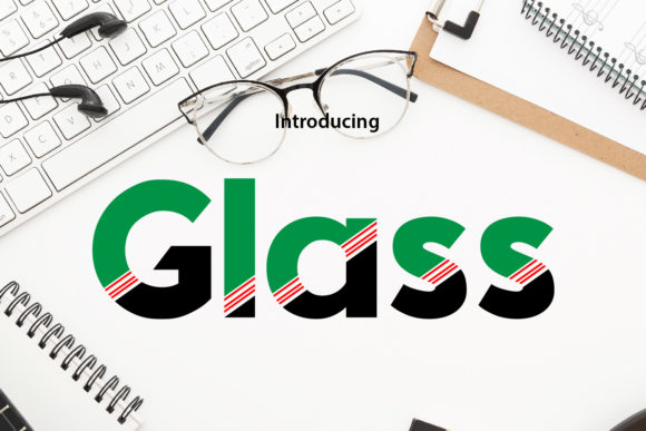
Glass is a display font—designed not for paragraphs, but for moments that need to land. Its letterforms balance geometric precision with subtle organic warmth: clean terminals, open counters, and just enough contrast to guide the eye without sacrificing elegance. It’s not minimalist, but it’s uncluttered. Not playful, but it breathes with freshness. In practice, that means Glass works beautifully as a visual anchor—whether it’s a course title above a signup form, a brand name in a sticky header, or a bold tagline layered over a soft-focus background image.
I tested it across devices: desktop, tablet, and iPhone. On larger screens, Glass holds its character at 48–72px with generous letter spacing. On mobile, I found it shines best between 32–44px—still legible, still distinctive, never cramped. The key was letting it breathe: I added 0.05em tracking in CSS and avoided stacking it directly over busy imagery without subtle text shadows or overlays.
Where Glass Performs Best (and Where to Pause)
In my real-world test—a soft-launch landing page for a small creative retreat—I used Glass for:
- The main headline (“Find Your Rhythm”) in the hero section
- Section dividers (“Your Journey,” “What’s Included,” “Next Steps”)
- CTA button text (“Reserve Your Spot”) — paired with a subtle hover scale effect
- A single decorative accent: the word “Gather” centered beneath a hero illustration
All performed well—but only because I respected its role. Glass isn’t built for body copy, navigation menus, or form labels. I kept those in a clean, highly legible sans serif (Inter, loaded via Google Fonts). That contrast wasn’t accidental—it created hierarchy, trust, and rhythm. Users scanned the Glass-driven headlines first, then settled into the calm, readable body text. No squinting. No bounce rate spikes.
One note on accessibility: while Glass passes basic contrast checks against white and light neutrals (AA compliant at 32px+), I avoided using it on dark mode backgrounds without testing contrast manually. Its lighter weight and open shapes can soften on charcoal or navy—so I reserved it for light or mid-tone backgrounds unless pairing with a solid overlay.
Pairing Thoughtfully for Web Harmony
Display fonts live or die by their pairings—and Glass thrives when matched with intention. I landed on two reliable combinations:
- Sans serif companion: Inter or Manrope for body, captions, buttons, and UI elements. Their neutrality lets Glass shine without competing.
- Serif alternative: A gentle, low-contrast serif like Cormorant Garamond for blog headers or testimonial quotes—adding editorial warmth where appropriate.
I skipped script or handwritten pairings for this project. While tempting, they clashed with Glass’s modern clarity. Save those for mood-driven campaigns—not core site identity.
Practical Considerations Before You Deploy
Before adding Glass to your next site or client project, check these five things:
- Webfont format: Confirm it’s available as WOFF2 (smallest, fastest) and includes fallback options. I used the variable font version where supported—giving me precise weight control without loading multiple files.
- Weights & styles: The standard set includes Regular and Bold—enough for most branding needs. No italic, so avoid relying on browser-synthesized slants.
- Licensing: Verify commercial web use is covered—especially if embedding in SaaS dashboards, client sites, or template kits. Some licenses restrict usage tiers or require extended coverage.
- Language support: Covers Latin-based languages well (English, Spanish, French, German, etc.). If you serve broader audiences, double-check diacritic rendering—especially for accented characters in headings.
- Load strategy: I preloaded the font for the homepage hero, then let secondary uses load asynchronously. This kept LCP fast while preserving typographic intent.
More Than Just a Typeface—A Tone Setter
What surprised me most about Glass wasn’t how it looked—but how it shaped perception. On the retreat site, visitors described the experience as “calm but intentional,” “elegant but approachable.” That’s not accidental. Typography influences tone before a single word is read. Glass signals clarity, care, and quiet confidence—ideal for wellness brands, creative educators, boutique studios, and service-based businesses that value substance over flash.
It doesn’t try to be everything. It knows its lane: standout moments, meaningful emphasis, brand-defining statements. And because it’s restrained—not ornate, not eccentric—it scales gracefully across contexts: from a responsive portfolio grid to an email header, from a digital brand kit PDF to a social media banner preview.
If you’re choosing a display font for your next web project, ask yourself: does it elevate meaning—or just decoration? Does it invite attention without demanding it? Does it feel like part of your voice, not a costume? With Glass, the answer, consistently, has been yes.